BRANDING | PRINT DESIGN | WEB DESIGN
Hackett Property provides a proactive, friendly approach to a wide range of property needs. Their client base includes buyers, sellers, investors, professional tenants, students and UK and overseas landlords, and their reputation and track record mean they’re well respected across the North East.
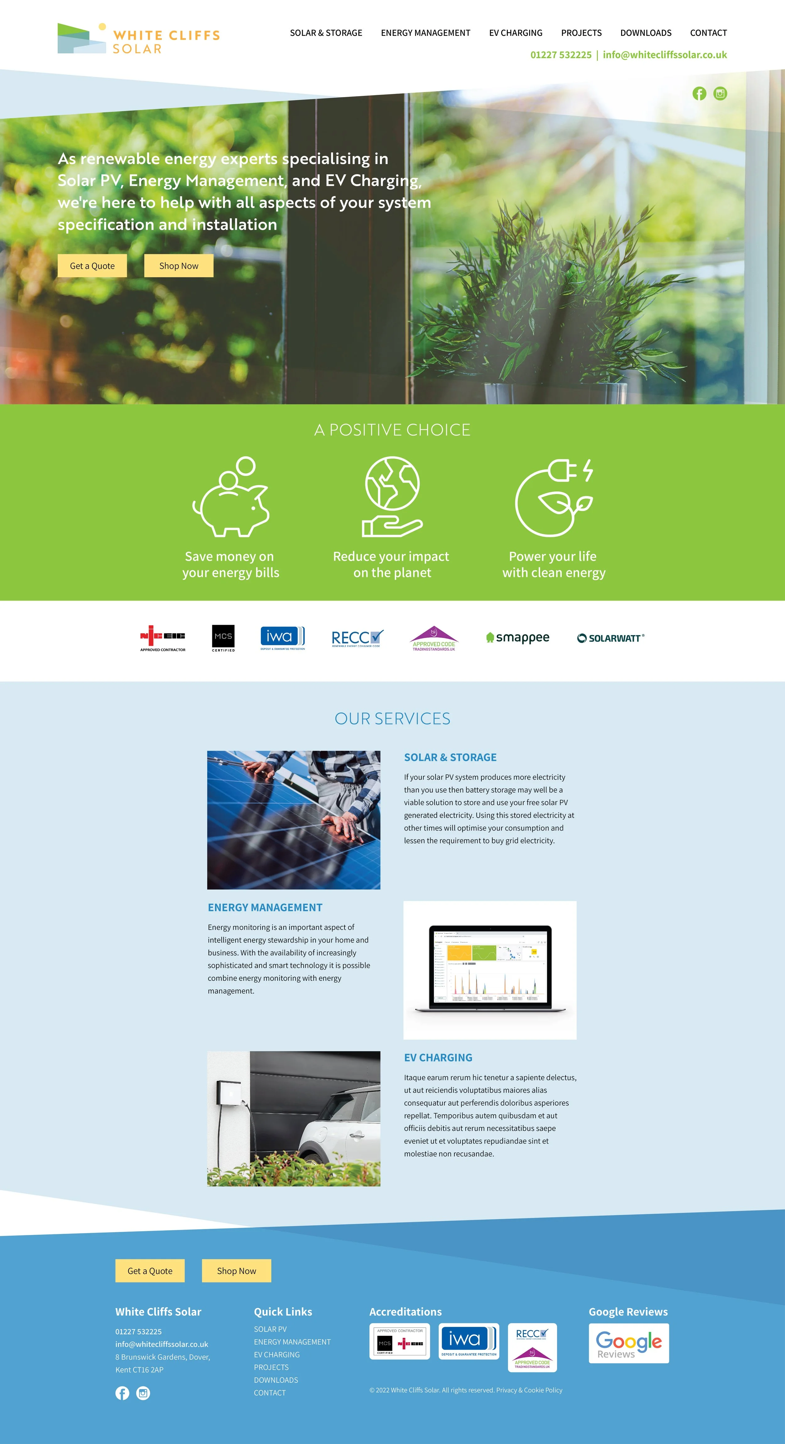
White Cliffs Solar
The Brief
After speaking to owners, Brendan and Haley, we all agreed on the existing brand red – as well as having strong links with the city of Sunderland – provided great standout and differentiation from their main competitors. But we also agreed that the identity was being used inconsistently everywhere, leading to a ‘watered down’ presentation, so the brief was to strengthen and modernise the brand mark, and then review and rationalise their marketing materials for a more coherent, unified look.
The Solution
After exploring various graphic and typographic treatments we presented a range of logo concepts. This option – with its offset ‘h’ and contemporary upper-and-lower case typography was immediately their favourite. And since delivering their ‘master logo’ artworks and brand guidelines, we’ve been working with their brilliant team – redesigning their corporate stationery, Social Media graphics, sales and lettings boards, and producing merchandising and advertising concepts for their head office.


